
SEO friendly web design is the practice of structuring and building websites so that search engines can crawl, index, and rank them easily, while delivering a clear experience for real visitors. The industry term for this approach is “SEO by design,” meaning optimisation is built into the site from day one rather than added afterwards. For small and medium-sized businesses in Buckinghamshire, this matters enormously. The top 3 search results capture around 75% of organic clicks, which means a poorly designed site hands those visitors directly to your competitors. Getting the design right from the start is the single most effective thing you can do for your online visibility.
What does SEO friendly web design actually involve?
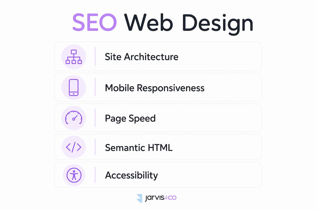
SEO friendly web design covers five interconnected areas: site architecture, mobile responsiveness, page speed, semantic HTML, and accessibility. Each one affects how search engines read your site and how visitors experience it. Poorly structured navigation, slow load times, and mobile unfriendliness undermine SEO regardless of how good your written content is. That is the core problem many Buckinghamshire businesses face. They invest in great copy but launch on a site that search engines struggle to read.
The goal is not to design for Google alone. You design for people first, but you build the technical foundation so that search engines can follow along without friction. Both objectives are achievable at the same time when you plan properly.

How does site architecture and navigation support SEO friendly design?
Site architecture is the skeleton of your website. A flat pyramid structure keeps every important page reachable within a small number of clicks, which benefits both visitors and search engine crawlers. A flat hierarchy ensures important pages are reachable within 3–4 clicks, improving crawlability and usability in one move.
The key structural elements to get right
-
Clear navigation menus with descriptive labels tell visitors and crawlers exactly what each section contains. Avoid clever but vague labels like “Solutions” when “Web Design Services” says the same thing more clearly.
-
Breadcrumbs show visitors where they are within the site and give search engines an additional signal about page hierarchy. Breadcrumbs and internal links aid crawlability and help distribute authority across the site.
-
Internal linking connects related pages so that crawlers can move through your site without hitting dead ends. Orphan pages, those with no internal links pointing to them, are effectively invisible to search engines.
-
Clean URLs use plain language and include relevant keywords. A URL like
/web-design-buckinghamshireis far more useful than/page?id=47.
| Structural element | SEO benefit |
|---|---|
| Flat site hierarchy | Reduces crawl depth, improves indexing speed |
| Descriptive navigation labels | Helps search engines understand page topics |
| Breadcrumb trails | Reinforces page hierarchy and improves usability |
| Internal links | Distributes authority and prevents orphan pages |
| Keyword-relevant URLs | Signals page topic to search engines directly |
Pro Tip: Map your full site structure on paper before you build anything. If you cannot reach every key page within three clicks from the homepage, simplify the hierarchy before writing a single line of code.
What role does mobile-first responsive design play in SEO?
Google uses the mobile version of your website as the primary basis for indexing and ranking. This is called mobile-first indexing. Mobile-first responsive design ensures the same content is served on all devices, which keeps your rankings consistent whether someone visits from a phone in Aylesbury or a desktop in London.
Responsive web design achieves this through flexible grids, scalable images, and CSS media queries that adapt the layout to any screen size. The content itself does not change. Only the presentation adjusts. This is the correct approach because it avoids the old pitfall of maintaining a separate mobile site with different content, which confused search engines and split authority between two URLs.
Common mobile SEO pitfalls to avoid
-
Touch targets, meaning buttons and links, must be large enough to tap without error. Google recommends a minimum size of 48 x 48 pixels.
-
Text must be readable without zooming. A base font size of 16px is the accepted standard for body text on mobile.
-
Avoid placing important content inside elements that require interaction to reveal, such as accordions that do not render in HTML. Search engines may not see that content.
-
Test on real devices, not just browser emulators. Emulators do not replicate every real-world rendering issue.
Pro Tip: Use Google Search Console’s Mobile Usability report to identify specific pages where mobile issues are already affecting your site. It is free and gives you exact error descriptions, not guesses.
How do page speed and Core Web Vitals influence your site’s rankings?
Page speed is a confirmed Google ranking factor. More specifically, Google measures performance through a set of metrics called Core Web Vitals. Core Web Vitals, including LCP under 2.5 seconds and CLS below 0.1, are confirmed ranking signals influenced directly by web design decisions. These are not abstract technical scores. They measure real experiences: how fast the main content loads, how stable the page is as it loads, and how quickly the page responds to interaction.
Practical steps to improve page speed
-
Compress and convert images. Use modern formats such as WebP instead of PNG or JPEG. Serve images at the correct display size rather than scaling them down with CSS.
-
Enable lazy loading. Images below the fold should load only when the visitor scrolls to them. This reduces the initial page load time significantly.
-
Minimise render-blocking resources. CSS and JavaScript files that load in the
<head>of a page delay the browser from displaying content. Move non-critical scripts to the bottom of the page or load them asynchronously. -
Choose a fast hosting provider. Server response time contributes directly to LCP. A slow server undermines every other optimisation you make.
-
Use a content delivery network (CDN). A CDN serves your site files from servers geographically close to each visitor, reducing latency for users across the UK and beyond.
-
Audit with Google PageSpeed Insights. This free tool scores your site against Core Web Vitals and lists specific fixes in priority order.
Pro Tip: Fix your Largest Contentful Paint score first. LCP is the single metric most directly tied to perceived load speed, and improving it tends to lift your overall Core Web Vitals score faster than tackling CLS or INP in isolation.
Why does semantic HTML and accessibility matter for SEO?
Semantic HTML is the practice of using HTML tags that describe the meaning of content, not just its appearance. Tags like <article>, <section>, <nav>, <header>, and <footer> tell search engines what each part of the page does. Semantic HTML tags and proper heading hierarchy give search engines clearer signals about content structure and relevance. A page built with meaningful tags is easier to parse than one built entirely with generic <div> elements.
Heading structure follows the same logic. Every page should have exactly one <h1> tag containing the primary topic. Subheadings use <h2> through <h6> in a logical order. Skipping levels, for example jumping from <h1> to <h4>, confuses both visitors and crawlers.
Accessibility practices that directly support SEO
-
Alt text on images describes visual content to screen readers and to search engines, which cannot see images. Write descriptive alt text that reflects what the image shows, not just “image1.jpg.”
-
Colour contrast ratios meeting the WCAG AA standard (4.5:1 for normal text) make content readable for users with visual impairments and signal a well-built site.
-
Keyboard navigation allows users who cannot use a mouse to move through your site. Search engine crawlers also navigate in a similar linear fashion, so a keyboard-accessible site is generally a more crawlable one.
-
Structured data markup (also called schema) adds machine-readable labels to your content. A local business schema, for example, tells Google your name, address, phone number, and opening hours in a format it can display directly in search results.
Accessible design practices like alt text, contrast ratios, and keyboard navigation benefit SEO and expand your reach to a wider audience at the same time. Accessibility and SEO are not separate concerns. They share the same underlying goal: making content available to everyone who wants it.
One technical point worth flagging: hiding content behind complex JavaScript or interactive elements risks that content never being crawled. If your product descriptions or service pages rely on JavaScript to render, search engines may index a blank page instead of your content.
Pro Tip: Run your site through the WAVE accessibility tool. It highlights missing alt text, poor contrast, and structural errors in one pass, many of which are also SEO issues in disguise.
Key takeaways
SEO friendly web design requires site architecture, mobile responsiveness, page speed, semantic HTML, and accessibility to work together from the moment a site is built.
| Point | Details |
|---|---|
| Build a flat site structure | Keep every key page reachable within 3–4 clicks to improve crawlability. |
| Prioritise mobile-first design | Google indexes the mobile version first, so responsive design is non-negotiable. |
| Meet Core Web Vitals targets | Aim for LCP under 2.5 seconds and CLS below 0.1 to satisfy ranking signals. |
| Use semantic HTML correctly | One H1 per page, logical heading order, and meaningful tags help search engines parse content. |
| Treat accessibility as an SEO asset | Alt text, contrast ratios, and keyboard navigation improve both rankings and reach. |
Why I think most businesses get this backwards
Most business owners I speak with treat SEO as something you bolt on after the website goes live. You finish the design, you launch, and then you ask someone to “do the SEO.” That approach costs you months of ranking potential and often requires rebuilding parts of the site you have just paid for.
The businesses that get the best results treat SEO as a design constraint from the very first wireframe. Before you choose a colour palette or write a homepage headline, you should know which search terms you are targeting and how your site structure will reflect those topics. SEO by design requires a coordinated workflow among designers, developers, and product managers using reusable, optimisation-ready components. That is not a luxury for large agencies. It is a practical discipline any small business can follow.
The uncomfortable truth is that a beautiful website with poor structure will always lose to a plainer site with clean architecture and fast load times. Search engines do not see your design. They see your code, your structure, and your speed. Invest in getting those right first, and the design can be as polished as you like on top of that foundation.
— Luke
How Jarvisandco helps businesses build sites that rank
Jarvisandco is a creative design agency with over 15 years of experience building websites that look great and perform well in search. Every site Jarvisandco builds treats SEO as part of the design process, not an afterthought. That means clean architecture, mobile-first layouts, fast load times, and semantic code are built in from the start. For businesses across Buckinghamshire and the wider UK looking to grow their online presence, Jarvisandco offers bespoke web design services that combine strong visual identity with the technical foundations search engines reward. Get in touch to talk through what your site needs.
FAQ
What is SEO friendly web design?
SEO friendly web design is the practice of building websites with a structure, code, and layout that search engines can crawl and index easily, while delivering a clear experience for visitors. It integrates optimisation into the design process from the start rather than adding it after launch.
How does site structure affect SEO?
A flat site hierarchy keeps important pages reachable within 3–4 clicks, which improves crawl efficiency and helps search engines index your content faster. Poor structure means some pages may never be found or ranked.
Why does mobile-first design matter for search rankings?
Google uses the mobile version of a website as its primary index, so a site that performs poorly on mobile will rank lower even for desktop searches. Responsive web design ensures consistent content and performance across all devices.
What are Core Web Vitals and do they affect rankings?
Core Web Vitals are Google’s performance metrics covering load speed (LCP), visual stability (CLS), and interactivity (INP). They are confirmed ranking signals, meaning a site that fails these thresholds is at a disadvantage in search results.
Does accessibility improve SEO?
Accessible design practices such as alt text, proper heading structure, and keyboard navigation directly support SEO by making content easier for search engines to parse. They also expand your audience to users with disabilities, broadening your potential reach.