Pick Pantone for any colour that has to look identical every time it prints: logos, brand marks, packaging solids. Pick CMYK for photography, gradients, and full-colour artwork where four inks blending on press is the only practical option.
- Pantone: a premixed, single spot ink. It prints as one solid colour, not a blend, so it's the most consistent option available.
- CMYK: a four-colour process. Cyan, magenta, yellow and black dots combine to simulate millions of colours, ideal for images but harder to lock down exactly.
- Next step: work out which colours in your brand are non-negotiable, then ask your printer for a spot ink quote or an approved CMYK proof before you sign off any file.
Key Takeaways
Choosing Pantone or CMYK correctly, and proofing that choice properly, is what keeps brand colour consistent across every print run and vendor.
| Point | Details |
|---|---|
| Match system to job | Use Pantone for brand-critical solids and CMYK for photography and complex art. |
| Expect gamut limits | Only around 55% of Pantone colours simulate closely in CMYK. |
| Never trust converters alone | Digital tools approximate; always verify with a printed proof under controlled lighting. |
| Document every approval | Record who signed off any spot-to-process fallback before the job runs. |
| Get expert support | Jarvis & Co manages spot ink specification, proofing, and vendor sign-off for brand-critical print work. |
Table of Contents
- Pantone vs CMYK printing at a glance
- How do CMYK and Pantone actually produce colour?
- When should you use Pantone versus CMYK?
- How do you convert and match Pantone to CMYK?
- What print variables shift your colour on press?
- What should you send your printer for predictable colour?
- How Jarvis & Co handles Pantone vs CMYK for clients
- Need your brand colour specified properly?
- Frequently asked questions
- Sources
Pantone vs CMYK printing at a glance
Neither system wins outright. Pantone wins on consistency and specific colours; CMYK wins on cost, speed, and its ability to reproduce photography. The table below reflects how the two compare on the factors that actually decide a specification.
| Factor | Pantone (spot) | CMYK (process) |
|---|---|---|
| Accuracy/consistency | Very high, same ink recipe every run | Variable, depends on press calibration |
| Gamut | Wider for solids, metallics, neons | Narrower, roughly 55% of PMS colours simulate closely |
| Best for | Logos, brand marks, packaging | Photography, gradients, complex art |
| Cost/setup | Extra plate or ink charge per colour | Included in standard four-colour setup |
| Speed/lead time | Slightly longer, ink mixing required | Faster, standard workflow |
| Special colours | Handles metallics, neons, pastels natively | Cannot reproduce these accurately |
- Choose Pantone when a single wrong shade would damage brand recognition.
- Choose CMYK when the job is dominated by photographic or continuous-tone content.
- Choose both when you need photography AND a guaranteed brand colour on the same piece.
Pro Tip: If a Pantone colour falls outside CMYK's range but full spot printing isn't in the budget, ask your printer about Extended Gamut (CMYKOGV) printing. It widens the reproducible colour range considerably without the cost of extra spot plates.
How do CMYK and Pantone actually produce colour?

CMYK is a subtractive process. Cyan, magenta and yellow inks each absorb part of the light spectrum, and printers add black because combining 100% cyan, magenta and yellow doesn't produce a true black, just a muddy brown. Both RGB and CMYK values are device dependent. They behave like recipes rather than fixed colours, meaning the same CMYK build can look different on two monitors or two presses.
Pantone works differently. A Pantone spot colour is a pre-mixed ink applied as a single solid, not built from dots of other colours. That's why Pantone publishes physical references such as the Pantone Formula Guide and Color Bridge, showing the actual printed spot swatch next to its closest CMYK simulation.
- CMYK dots create the illusion of continuous colour through halftone patterns.
- Pantone spot inks are applied as solids, with no dot pattern involved.
- Guides like Color Bridge let you see the gap between spot and process before you commit to a print run.
Pro Tip: Get your monitor colour-managed with an ICC profile before you soft-proof anything. Without one, what you see on screen has no reliable relationship to what comes off the press.
When should you use Pantone versus CMYK?
Brand-critical solids belong in Pantone. That includes packaging brand marks, logos, metallics, and neons, none of which CMYK reproduces convincingly. Photography, gradients, and detailed illustration belong in CMYK, since blending millions of shades from four inks is exactly what the process was built for.
Most real jobs mix the two. A common approach uses CMYK for photographic content plus one or two spot inks for the primary brand colour, sometimes called 5- or 6-colour printing. It costs more than a straight four-colour run but far less than converting an entire job to spot.
- Packaging with multiple SKUs and heavy photography: consider Extended Gamut printing as a middle ground.
- Short-run stationery or signage with a single brand colour: a spot ink is usually worth the extra plate charge.
- High-volume brochures dominated by photography: standard CMYK, with a spot only if the logo demands it.
Cost and lead time both shift with every added ink, so weigh the brand risk of a slightly-off logo against the setup charge before deciding.
How do you convert and match Pantone to CMYK?
Converting a Pantone spot colour to CMYK is never a straight swap. It's an approximation exercise, and it needs verification at every stage.
- Soft-proof the build using your printer's specific ICC profile, not a generic one.
- Calculate ΔE (the numerical colour difference) where your workflow supports it.
- Print a physical process proof on the actual stock the job will run on.
- Get sign-off from the brand owner before the job goes to press.
Digital tools have their place but come with limits:
- Pantone Connect gives designers digital references and libraries, but Pantone itself recommends printed guides for final brand-critical approval.
- Free lookup tools like Preflight's Pantone to CMYK reference offer quick approximations, useful for early comps, not for sign-off.
- Converters such as PrinterTools calculate CMYK from Pantone reference values mathematically. They're workflow aids, nothing more.
Pro Tip: Never approve a brand colour from a screen alone. A converter can't account for how ink actually sits on your chosen paper under real light, so treat every digital match as a starting point, not a verdict.
What print variables shift your colour on press?
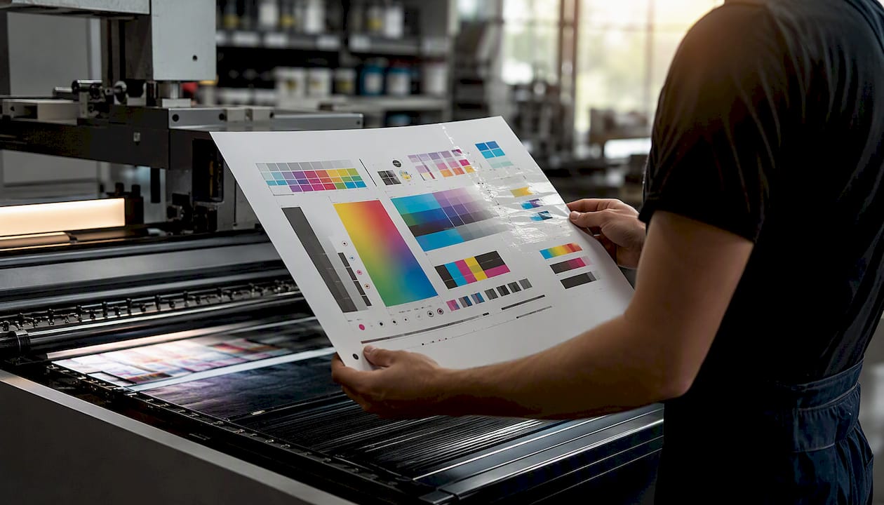
Substrate matters more than most designers expect. Coated stock reflects more light and holds ink on the surface, giving brighter, denser colour. Uncoated stock absorbs ink, causing dot gain, where dots spread slightly and colours look duller and darker than the file suggested.
Press condition matters just as much. Calibration drifts, ink batches vary, and no two presses reproduce the same CMYK recipe identically, which is exactly why the same job can look subtly different between two print vendors even when the files are unchanged.
- Always request a proof on the actual substrate the job will run on, not a generic proofing paper.
- Ask what your vendor's press maintenance and calibration schedule looks like if colour consistency across runs matters.
- Specify viewing conditions (a standard D50 light box, for example) when approving proofs, since daylight, office lighting and phone screens will all show you a different colour.
What should you send your printer for predictable colour?
A clean handoff prevents most colour disputes before they start. Include Pantone spot channels labelled clearly and separately in your file, alongside your CMYK composite built with the correct ICC profile for the intended press and stock.
- State clearly whether the job runs on coated or uncoated stock.
- Note any ΔE tolerance you expect the printer to hit, if your workflow tracks it.
- Confirm the proof type you're approving against: a contract proof, or a full press check.
- Supply PDF/X-1a or PDF/X-4 files, with fonts embedded and images linked at full resolution.
- Record who approved any spot-to-process fallback, in writing, before the job goes to print.
How Jarvis & Co handles Pantone vs CMYK for clients
We default to spot inks for primary brand marks whenever budget allows, with a documented CMYK fallback agreed in advance for every other application. Every project runs through swatch books, proofs, and signed approval records, so colour holds steady across print runs and vendors. It's the same discipline we apply across logo design and identity work.
Need your brand colour specified properly?
Getting Pantone and CMYK right on paper is one thing. Getting a printer to hold that colour consistently across a five-thousand-unit packaging run, a stationery reprint eight months later, and a pop-up banner from a different vendor entirely is another problem altogether.

Jarvis & Co handles that whole chain for you: brand colour specification, print-ready files, proof management, and vendor sign-off, so you're not the one chasing three different suppliers to explain why their reds don't match. We build the colour rules into your brand system from day one, working from the same print design process we use on every packaging, signage, and stationery project. If you're setting up a new brand or fixing inconsistent print output, get in touch about your website and branding project and we'll walk through what your files need before they go anywhere near a press.
Frequently asked questions
Is Pantone always more expensive than CMYK? Usually, yes, because each spot colour needs its own ink and often its own plate. For a single brand mark on a short run, the cost difference is often small enough to justify the consistency gained.
Can every Pantone colour be converted to CMYK? No. Roughly 55% of PMS spot colours convert to CMYK with only a small visible difference; the rest, particularly metallics, neons and some deep colours, fall outside CMYK's range entirely.
What is bleed in printing, and does it affect Pantone or CMYK differently? Bleed is the extra artwork extending beyond the trim edge so no white gaps appear after cutting. It applies equally to spot and process work; the colour system doesn't change the bleed allowance.
How much bleed do I need for print? Most commercial printers ask for 3mm of bleed, though some packaging and die-cut jobs need more. Always confirm with your specific printer before finalising files.
Should I use CMYK or RGB for print files? CMYK for print, always. RGB is built for screens and covers a wider range of colours than most presses can reproduce, so files sent in RGB usually shift, often unpredictably, when converted at the print stage.
What's the difference between spot colour and process colour? Spot colour is a single premixed ink printed as a solid. Process colour, CMYK, builds colour from four inks printed as tiny dots that blend visually. Spot is more consistent; process is more flexible for complex imagery.
Do I need an ICC profile for every print job? For anything colour-critical, yes. An ICC profile tells your software how a specific press and stock combination will render colour, so your soft proof actually resembles the final print.