If you need a tradesman logo that works on vans and workwear, choose a simple, bold wordmark or icon+text design and get proper vector files. Hire a designer only if you need real distinctiveness across a lot of touchpoints. That's the whole decision in one sentence, and it holds true whether you're a sole trader plumber or running a team of ten electricians.
Here's why it works. A tradie logo needs to stay readable whether it's printed on a van door, embroidered on a polo shirt, or shrunk down to a Facebook profile picture. Complicated marks fall apart at small sizes and cost more to reproduce consistently. Simple ones don't.
Your next move depends on where you're starting from:
- Sketch two or three name or icon ideas on paper before touching software.
- Try a free logo maker template to see roughly how a mark might look.
- Request a quote from a designer if you want something nobody else can copy.
Key Takeaways
A distinctive tradesman logo succeeds when it stays simple, uses two to three colours, and ships as vector files ready for vans, workwear and web.
| Point | Details |
|---|---|
| Pick a style that fits your trade | Wordmark, icon+text, badge, monogram or mascot, chosen by how visible and legible it needs to be. |
| Limit your palette | A small number of colours keeps signage and embroidery costs down and improves recognition at distance. |
| Demand vector files | EPS, SVG or PDF formats scale to van panels and shrink to social avatars without quality loss. |
| Test before you commit | Mock the logo up at van-size, embroidery-size and avatar-size before approving a final design. |
| Get a professional identity from Jarvisandco | Jarvisandco delivers logo, brand rules and livery-ready files as one consistent package. |
Table of Contents
- Tradesman logo ideas and styles you can actually copy
- What colours and fonts actually work on a van?
- How should your logo work across vans, uniforms and signage?
- Should you DIY, use a logo maker, or hire an agency?
- Jarvis & Co case study: a trades identity that works
- What do successful tradesman logos actually have in common?
- Sources
Tradesman logo ideas and styles you can actually copy
Most trade logos fall into five workable categories. Pick one that fits how your business actually operates, not just what looks good on screen.
- Wordmark. Just your business name, styled distinctively. Works best when the name itself is memorable, like "Hartley & Sons" or "Bright Spark Electrical." Pros: cheap to produce, translates cleanly to van signage, easy to update. Cons: does nothing to signal your trade visually, so the name has to carry the weight.
- Icon + text. A stylised symbol paired with your business name, the most common format for construction logo ideas and plumber logo ideas alike. A hammer, a wrench, or a roofline works if it's simplified into clean shapes rather than drawn literally. Avoid clip-art tools; they read as generic and date quickly.
- Badge or emblem. The name and symbol sit inside a circular or shield-shaped frame. This suits businesses wanting a heritage or premium feel, particularly established firms or those competing on trust rather than price.
- Monogram. Initials only, often two or three letters interlocked. Works well for family firms or when the full business name is long and won't fit cleanly on a van door.
- Mascot. A character or illustrated figure, useful when you want a friendly, local-facing brand, think a cartoon fox for a pest control firm or a grinning builder character. Riskier for electrician logo ideas or anything needing a serious, safety-first tone.
Pro Tip: Whatever style you pick, avoid the obvious cliché for your trade, don't reach for a wrench icon just because you're a plumber. A slightly abstracted shape or a strong wordmark often reads as more professional than a literal tool illustration.
What colours and fonts actually work on a van?
Stick to two or three colours maximum. Every additional colour adds cost to signage, embroidery, and print, and it makes your logo harder to recognise at a glance, which is the entire point of a logo on a moving vehicle.
Certain palettes have become associated with certain trades for good reason:
- Construction and building: navy, safety orange, or charcoal with a single accent colour; reads as sturdy and industrial.
- Plumbing and heating: blue and white dominate, evoking water and cleanliness without saying either word.
- Landscaping and gardening: greens paired with brown or a warm neutral, grounded and natural without looking twee.
- Electrical: yellow or amber against black or navy signals energy and caution without literally drawing a lightning bolt.
Typography matters just as much as colour. Choose bold, highly legible sans-serif fonts, thin or script fonts vanish at a distance and blur when embroidered. Condensed or geometric sans-serifs work well when your business name is long, since they fit more characters into the same van panel without shrinking the text past readability. Simple marks hold up far better when scaled down to favicon size or reduced for embroidery, a rule that applies just as much to a plumber's logo as it does to any other brand.
How should your logo work across vans, uniforms and signage?
A logo that only looks good on a screen isn't finished. Before you sign off on a design, confirm it has every variant and file format you'll actually need.
Essential variants to request:
- Full-colour version, for digital use and premium print.
- Single-colour version, for embroidery, engraving, and one-colour signage.
- Reversed version (light logo on dark background), for dark van wraps or workwear.
- Icon-only version, for social media avatars and small spaces.
- Horizontal and stacked layouts, so the logo fits both wide van panels and narrower invoice headers.
File formats to ask for:
- EPS, SVG, or PDF (vector files), scalable to any size without pixelation, essential for van livery and large signage.
- PNG and JPEG, for websites, email signatures, and social profiles.
- CMYK colour values and spot colour references, so your printer or sign-writer matches your exact brand colours every time.
Before finalising anything, mock the logo up at three sizes: van-door scale, embroidered chest-badge scale, and a 32-pixel social avatar. If it holds up at all three, it's ready.
Should you DIY, use a logo maker, or hire an agency?
This comes down to budget, urgency, and how much you need to stand out from every other firm in your area.
- DIY with a free tool: fastest and cheapest option, often free or under £50. Logo makers provide editable templates and vector downloads, but they need customisation, and there's a real chance a competitor picks a near-identical template.
- Freelancer: typically a few hundred pounds, turnaround of one to two weeks. Good middle ground if you need something original but don't need a full brand system.
- Design agency: a larger investment but delivers a complete identity, brand guidelines, and file pack built for every use case, from van livery to social media.
Pro Tip: Save yourself back-and-forth emails by writing a short brief first: what your business does, who your customers are, where the logo needs to appear, and your rough budget. A tighter brief gets you better quotes faster.
Jarvis & Co case study: a trades identity that works
Jarvisandco worked with Leigh & Co on a full trades brand identity, taking the business from an inconsistent, DIY-built logo to a cohesive system covering vehicle livery, workwear, signage, and web. The brief centred on legibility at distance and a colour palette that would photograph well across job sites and social content.
A logo is only as strong as the positioning behind it. Get clear on who you serve before you touch the design.
With over 15 years in branding and web design, Jarvisandco builds file packs that roll out cleanly across every touchpoint a trade business needs, van, uniform, and homepage alike, without the inconsistency that comes from stitching together free templates.
What do successful tradesman logos actually have in common?
Look closely at the trade logos that stick in your memory and a pattern emerges: they're almost all simple enough to sketch from memory. That's not an accident. It's the entire strategy.
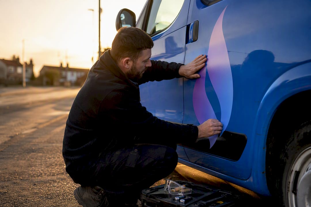
Take a heating engineer using a minimalist flame icon paired with a bold, condensed wordmark in deep blue and white. The palette signals warmth and reliability without a single word of copy, and the flame shape stays crisp whether it's on a 6ft van decal or a 40px app icon. Compare that to a competitor running a photorealistic illustration of a boiler, detailed, technically accurate, and completely illegible once it's shrunk onto an invoice header.
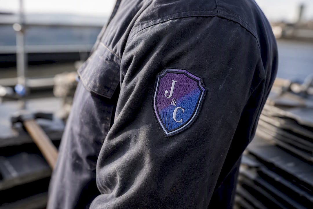
Roofing and construction firms that lean on badge-style emblems, a shield shape wrapped around initials, tend to read as more established even when the business is only a few years old. The badge format borrows visual cues from trade guilds and heritage brands, lending weight that a plain wordmark can't always achieve on its own.
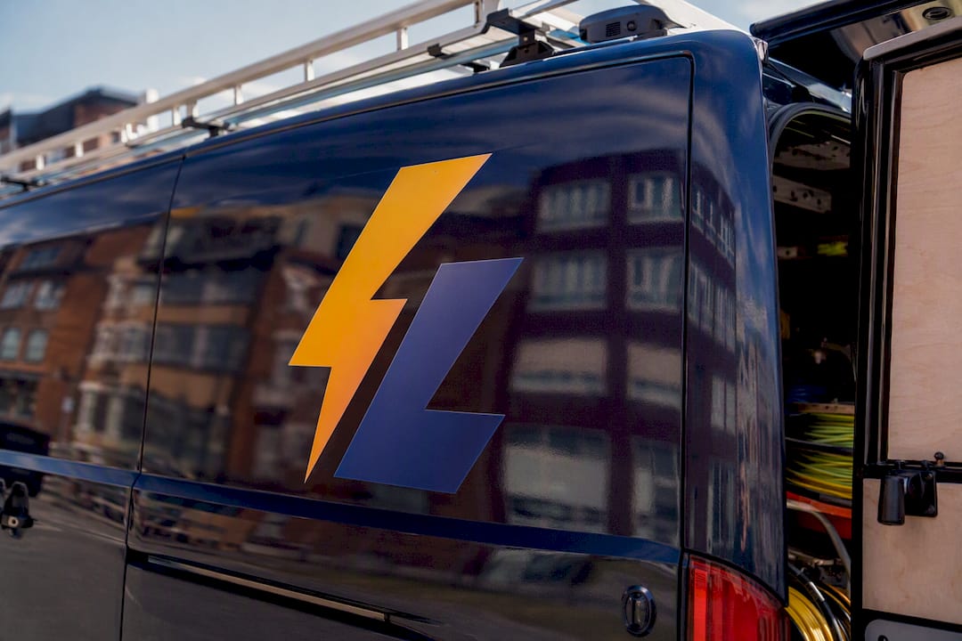
Electrical firms using amber against navy consistently outperform those mixing three or more colours, simply because the two-tone contrast reads instantly on a moving vehicle. The lesson across every strong example is the same: distinctiveness comes from restraint, not detail. A logo has to work as a component of a wider visual identity, not as a standalone illustration competing for attention against itself.
A short designer's note: mistakes we see and one quick fix
Two mistakes come up constantly: icons packed with too much detail, and fonts too light to survive vehicle signage. Test your design at van-size and embroidery-size before you approve anything, and use a written brief when you approach a professional. It saves rounds of revisions.
— Luke
How Jarvis & Co can help: logo, identity and vehicle livery packages
Jarvisandco is the alternative to piecing together a brand from free templates and separate freelancers. You get one team handling your logo, your full identity, and livery-ready files that fit your van, workwear, and website without a single mismatched colour between them.

A commissioned identity project with Jarvisandco typically includes vector files in every format your sign-writer and embroiderer will ask for, written brand rules covering colour and typography, and mock-ups showing your logo on a vehicle before you commit to printing. If you'd rather see the process first, the Level Up Fitness brand identity project shows how a full rollout comes together in practice. When you're ready, browse the logo design service and send over a brief, most trades get a first response within a couple of days.
Sources
For more detail on formats and inspiration, these guides are worth a look:
- Tradie Logo Design: Branding for Trades and Contractors - Digitalways
- Tradesman Logos | BrandCrowd
- Unveiling the divide: brand vs logo - Penn State Extension