A call to action is the verb-led prompt that tells a visitor exactly what to do next, whether that's "Buy Now," "Start Your Free Trial," or "Book a Consultation." This guide gives you channel-by-channel CTA examples, a copy-ready phrase bank, and testing rules you can put to work today. Every example below is built to adapt and test straight away.
TL;DR:
- Clear, benefit-led CTAs like "Try It Free, No Credit Card Needed" significantly reduce sign-up objections for SaaS products.
- Mobile optimization with large, high-contrast buttons ensures higher click-through rates, especially on smartphones.
- Proper placement above the fold and consistent testing of copy, color, and position lead to measurable improvements in conversion.
- Matching the CTA to the page intent, rather than just using generic phrases, results in higher engagement and more relevant actions.
- A/B testing one variable at a time over a full business cycle helps identify the most effective CTA strategy for different goals.
Table of Contents
- Call to action examples for every goal and channel
- Copy-ready CTA phrase bank and templates
- How to write an effective call to action
- Design and placement rules for CTA buttons
- Testing and measuring CTA performance
- Twenty annotated call to action examples worth studying
- Who's behind this guide and how Jarvisandco can help
- Why most CTA advice stops one step too early
- Sources
Call to action examples for every goal and channel
The best CTA for an ecommerce checkout page will flop on a SaaS trial signup, and a line that works in an email subject won't fit on a mobile button. Context decides everything. A high-converting CTA commonly follows a simple pattern: action verb + benefit + optional urgency, and that formula flexes differently depending on where the reader encounters it.
Grouping CTAs by channel and goal, rather than treating them as interchangeable, also makes A/B testing far easier to interpret. If you know a CTA's job is to reduce cart abandonment versus generate a cold lead, you can measure it against the right metric instead of a vague "engagement" number.
Ecommerce call to action examples
Online stores live and die by the checkout button, but the CTAs that matter start much earlier in the journey.
- "Add to Basket, Free Delivery Over £30" (product page, removes shipping-cost friction)
- "Shop the Sale Before It Ends" (category page, adds urgency without a fake countdown)
- "Get 15% Off Your First Order" (popup or header banner, incentivises signup)
- "Complete Your Order" (cart page, calmer tone for the final step)
- "See Sizing Guide Before You Buy" (product page, reduces returns by pre-empting doubt)
- "Notify Me When Back in Stock" (out-of-stock listings, captures demand you'd otherwise lose)
- "Buy Now, Pay in 3 Instalments" (checkout, highlights payment flexibility)
- "Add the Matching Set, Save 10%" (upsell block, benefit-led bundling)
SaaS and free trial call to action examples
Software buyers want proof before commitment, so the CTA's job is to lower perceived risk.
- "Start Your Free 14-Day Trial" (hero section, no card required implied or stated explicitly)
- "See It in Action, Book a Demo" (for complex tools where self-serve trials confuse buyers)
- "Try It Free, No Credit Card Needed" (removes the single biggest signup objection)
- "Upgrade to Unlock Unlimited Projects" (in-app CTA aimed at existing free users)
- "Compare Plans and Save" (pricing page, nudges toward annual billing)
- "Get Your Free Account in 30 Seconds" (specific and time-bound, both build confidence)
Lead generation call to action examples
When there's no product to click "buy" on, the CTA has to sell the exchange of information for value.
- "Download the Free Checklist" (gated content, benefit is the download itself)
- "Get Your Free Quote in Minutes" (service businesses, speed reassures)
- "Speak to an Expert, No Obligation" (removes the fear of a sales call)
- "Claim Your Free Consultation" (positions the offer as a gift, not a pitch)
- "Get the Report Delivered to Your Inbox" (whitepapers and research assets)
Email and newsletter call to action examples
Email allows longer, benefit-led copy because the reader has already opened the message. A minimum tappable button size still matters here, since most opens now happen on a phone.
- "Read the Full Story" (newsletter roundups, low commitment)
- "Grab This Deal Before Midnight" (flash sales, works because it's genuinely time-bound)
- "See What's New This Month" (product update emails)
- "Reply and Tell Us What You Think" (engagement-focused, invites a real response)
- "Unlock Your Discount Code" (loyalty and win-back campaigns)
Social ads and landing page call to action examples
Paid social has seconds to earn a click, so brevity wins, while landing pages can afford slightly more explanation because the reader has already committed to reading further.
- "Swipe Up to Shop the Collection" (Story-format ads)
- "Learn More" (low-friction, works when the ad image does the selling)
- "Join 10,000+ Subscribers" (social proof folded into the CTA itself)
- "Get Started Free" (landing page hero, pairs with a form below the fold)
- "See Pricing" (landing page, useful when price is a key decision factor)
- "Watch the 2-Minute Demo" (landing page, sets expectations on time investment)
Booking, appointment, and in-person call to action examples
Service businesses, clinics, and trades need CTAs that make scheduling feel effortless.
- "Book Your Appointment Online" (clinic and salon websites)
- "Check Available Times" (softer alternative that feels less committal)
- "Call Now for a Same-Day Slot" (trades and urgent callouts)
- "Reserve Your Table" (hospitality)
- "Ask a Question Before You Book" (reduces anxiety for first-time patients or clients)
Recruitment CTAs work differently again. Job-related prompts tend to emphasise flexibility and reduced friction rather than the scarcity or monetary incentives that drive ecommerce clicks, which is why "Apply in 2 Minutes" outperforms "Apply Now" on most careers pages.
Copy-ready CTA phrase bank and templates
Sometimes you don't need inspiration, you need forty options to test by Friday. Here's a phrase bank organised by intent, plus templates you can fill in for anything not already covered above.
Buy intent: "Shop Now," "Add to Basket," "Buy It Today," "Get Yours Before They're Gone," "Order Now," "Checkout Securely," "Claim Your Discount," "Grab the Deal."
Try intent: "Start Free Trial," "Try It Risk-Free," "See It in Action," "Test Drive the Features," "Get Instant Access," "Explore the Demo."
Subscribe intent: "Join the Newsletter," "Subscribe for Updates," "Get Weekly Tips," "Stay in the Loop," "Sign Up Free," "Become a Member."
Download intent: "Download the Guide," "Get the Free Template," "Grab Your Copy," "Save the Checklist," "Access the Report."
Book intent: "Book Now," "Schedule a Call," "Reserve Your Spot," "Check Availability," "Request a Callback," "Pick a Time That Suits You."
Join intent: "Join the Community," "Become a Member Today," "Get Involved," "Sign Up to Contribute," "Start Your Application."
A large library of channel-specific phrasing tends to be organised the same way, by goal first and channel second, because it maps far better onto how marketers actually test copy.
Twelve fill-in-the-blank templates cover most situations you'll face:
- "[Verb] Your [Benefit] Today"
- "Get [Specific Result] in [Timeframe]"
- "[Verb] Now, [Urgency Trigger]"
- "Join [Number] [Audience] Who [Benefit]"
- "Claim Your [Discount/Offer] Before [Deadline]"
- "See How [Product] Helps You [Outcome]"
- "Start [Action] in [Short Time Period]"
- "Get [Free Item] When You [Action]"
- "[Verb] [Product] and Save [Amount/Percentage]"
- "Book Your [Service] in [Timeframe]"
- "Unlock [Benefit] Instantly"
- "[Verb] Your Free [Asset Type]"
Treat this bank as a starting point, not a finish line. Every phrase needs localising for tone, currency, and regional phrasing before it goes live, and every one deserves at least one A/B test against your current default before you trust it.
How to write an effective call to action
Strip away the jargon and every strong CTA follows the same skeleton: verb + benefit + optional urgency. "Download," on its own, is a command with no reason attached. "Download Your Free Guide" gives the reader a reason. "Download Your Free Guide Before Friday" adds a reason to act now rather than later.
Compare "Submit" against "Get My Free Quote." Both sit on the same form, but one describes an action the system performs and the other describes a benefit the reader receives. Vague CTAs like Submit or Click Here consistently underperform against specific, benefit-led alternatives, largely because they ask the reader to do the mental work of figuring out what happens next.
Run every CTA through this six-point checklist before it ships:
- Clarity — could a first-time visitor say what happens if they click, without guessing?
- Specificity — does it name the actual benefit rather than a generic "learn more"?
- Value — is the reason to click stated, not implied?
- Urgency — is there a genuine reason to act now, or does urgency need to be dropped entirely?
- Friction removal — does the copy pre-empt the reader's biggest objection (price, commitment, time)?
- Page intent match — does the CTA match what the visitor came to that page to do?
That last point trips up more marketers than any other. A blog post CTA pushing "Buy Now" to someone who arrived from a search query about a problem, not a product, will always underperform a softer "Read the Related Guide."
Pro Tip: Swap "Your" for "My" on button copy. "Start My Free Trial" or "Get My Quote" reads as the reader speaking their own decision, and that small shift in first-person phrasing often lifts clicks on forms and checkout buttons more than a colour change ever will.
Design and placement rules for CTA buttons
Copy only does half the job. Design and placement decide whether anyone reads the words at all. High-contrast buttons, deliberate whitespace, and mobile-friendly tappable areas consistently boost clickability across the guides and case studies that track this.
A few non-negotiables:
- Give the button a colour that contrasts sharply with the surrounding page, not one that blends into your existing palette.
- Keep tappable targets generously sized on mobile. Thumbs miss small buttons far more often than cursors do.
- Surround the CTA with whitespace so it isn't competing with navigation links or body copy for attention.
- Place your primary CTA above the fold, and repeat it further down long pages rather than forcing readers to scroll back up.
- Use one primary CTA per screen. Secondary CTAs (like "Learn More") should look visually subordinate, not equal.
- Add a small clarifying qualifier beneath the button when there's friction to remove, such as "No card required" or "Cancel anytime."
More traffic arrives on a phone screen than a desktop for most UK websites now, which is exactly why button size and thumb reach deserve as much attention as the words inside the button. If your CTA looks perfect on a laptop but sits half off-screen on an iPhone, the copy underneath it barely matters.
Testing and measuring CTA performance
Guessing which CTA wins is optional. Testing isn't. A/B testing remains the reliable way to know which version converts, and platforms that report on aggregated experiment data consistently show measurable uplifts when marketers test copy, colour, or placement rather than assuming.
Run tests properly:
- Change one variable at a time — swap the copy, or the colour, or the placement, never all three together, or you won't know which change moved the number.
- Run long enough to cover a full business cycle — a test that only spans a weekend will skew toward whichever audience happens to browse on Saturdays.
- Track the metric that matches the CTA's job — click-through rate tells you if people notice the button, conversion rate tells you if they follow through, and revenue per visitor tells you if the change actually made money.
- Watch micro-conversions too — an email signup or a "view pricing" click often predicts a sale weeks later, so don't dismiss a test as a failure just because it didn't move revenue instantly.
Two experiments worth running this month: first, swap a generic CTA like "Submit" for a benefit-led version like "Get My Free Quote" and expect click-through rate to rise, since specificity almost always beats vagueness. Second, increase button contrast and size without touching the copy at all, and expect a smaller but still measurable lift in click-through rate on mobile specifically, where tappability is the bigger constraint than wording.
Twenty annotated call to action examples worth studying
Annotated examples teach more than a raw list ever can, because you see the reasoning behind the choice, not just the choice. Reviewing what works and what doesn't side by side is how most experienced copywriters actually learn the craft.
- "Get Started Free" (SaaS homepage) — Works because "free" removes the biggest objection immediately; could improve by adding "in 60 seconds" to set a time expectation.
- "Add to Basket" (ecommerce, generic) — Clear and familiar, but a benefit-led alternative like "Add to Basket, Ships Today" would likely outperform it.
- "Learn More" (blog CTA) — Vague, but appropriate here since the page's job is education, not conversion.
- "Book a Free 15-Minute Call" (consultancy landing page) — Specific time commitment lowers the perceived risk of booking.
- "Claim Your Spot" (event registration) — Scarcity language works when spaces are genuinely limited; loses credibility if the event never sells out.
- "Download the Checklist" (lead magnet) — Simple and clear; could test "Download the Free Checklist" to reinforce the cost is zero.
- "Try Risk-Free for 30 Days" (subscription box) — Strong because it names the exact guarantee period.
- "See Pricing" (SaaS navigation) — Direct and low-friction for buyers who already know they're interested.
- "Notify Me" (out-of-stock product) — Captures demand that would otherwise vanish; a small tweak to "Notify Me When Back in Stock" adds clarity.
- "Get 20% Off Your First Order" (email popup) — Number-led offers convert better than vague discount language.
- "Speak to a Specialist" (healthcare clinic) — Reassuring tone fits a sector where trust matters more than urgency.
- "Reserve Your Table" (restaurant site) — Hospitality-specific phrasing that feels natural rather than salesy.
- "Upgrade Now" (in-app banner) — Short and direct for an audience who already understands the product.
- "Get Instant Access" (online course) — "Instant" answers the unspoken question of how long they'll wait.
- "Request a Callback" (trades and services) — Removes the friction of making the first call themselves.
- "Join 5,000+ Members" (community site) — Social proof baked into the CTA itself builds trust fast.
- "Watch the Demo" (B2B software) — Lower commitment than "Book a Demo," useful earlier in the funnel.
- "Start My Free Trial" (SaaS, first-person) — The "My" phrasing often nudges click-through higher on forms.
- "Shop the Collection" (fashion retailer) — Slightly more evocative than "Shop Now," fits a lifestyle brand tone.
- "Get Your Free Quote in Minutes" (home services) — Speed reassurance addresses the reader's real concern: how long this will take.
Who's behind this guide and how Jarvisandco can help
This guide was put together by Luke, drawing on established conversion research and years of watching what actually moves the needle on client websites. Jarvisandco has spent 15+ years designing websites, branding, and digital campaigns for UK businesses, and CTA strategy sits at the centre of nearly every project.
A couple of examples from recent work:
- A Shopify store redesign that repositioned the primary "Add to Basket" button above the fold and added a delivery-benefit microcopy line, contributing to a measurable lift in checkout starts.
- A trades website that swapped a generic "Contact Us" for "Call Now for a Same-Day Quote," which shortened the enquiry-to-booking timeline noticeably.
If your CTAs are getting traffic but not clicks, that's usually a copy, contrast, or placement problem, and it's exactly the kind of thing Jarvisandco's website design service is built to fix.
Why most CTA advice stops one step too early
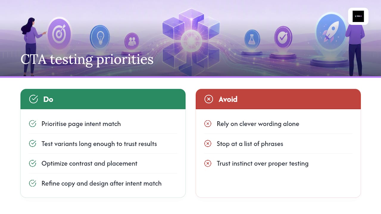
Most CTA guides hand you a list of phrases and call it done. That's the easy half. The harder, more useful half is deciding which phrase suits which page intent, and then actually testing it rather than trusting instinct. I'd argue the conventional advice overrates clever wording and underrates the boring mechanics: contrast, placement, and running a proper test long enough to trust the result.
If you take one thing from this piece, prioritise page intent match before you touch the wording. A perfectly written CTA on the wrong page will still underperform a plain one that matches what the visitor actually came to do. Get that right first, then spend your testing budget refining copy and design on top of it.
— Luke
Sources
A handful of sources back the guidance in this piece and are worth bookmarking for deeper reading:
- 10 Call to Action Examples That Convert (2026)
- Call-To-Action Button Examples + Tips for Making A Great CTA (2026)
- 25 Call to Action Examples & Why They Work (or Don’t)