The strongest brand guidelines share the same handful of traits, and you can see them in seconds when you open a good example. This is a curated set of inspectable brand guides from Apple, Netflix, Spotify, and others, each paired with a practical lesson you can copy. Frontify's own gallery of 19 real brand books proves the point: the best ones aren't clever, they're usable.
TL;DR:
- Static PDFs can quickly become outdated; living hubs with version control or searchable asset libraries are more effective for ongoing brand consistency.
- Clear sections like brand essence, logo system, color palette, type system, and misuse examples are essential for a practical and usable brand guide.
- Guides should be adaptable and revisited regularly, ideally aligned with milestones such as rebrands or product launches, to stay relevant and accurate.
- Over-specifying color shades, neglecting co-branding rules, or failing to include visual misuse examples significantly reduce the guide's effectiveness.
- Industry-specific approaches differ, with financial brands prioritizing strict rules, media brands emphasizing emotion, and premium brands focusing on restraint.
Table of Contents
- Brand guidelines examples every designer should open first
- What makes brand guidelines actually work
- How to adapt an example into your own working guide
- How brand guidelines differ across industries
- Why brand guidelines are never really finished
- Common mistakes that make guidelines unusable
- How Jarvisandco applies these lessons for clients
- Get a brand guide your team will actually use
- Sources
Brand guidelines examples every designer should open first
You learn more from ten minutes with a real brand book than from an hour of generic advice, so here's where to actually look. Each entry below tells you what the guide gets right and the one thing worth lifting for your own project.
-
Apple. Apple doesn't publish a public consumer brand book, but its developer-facing Human Interface Guidelines show the same discipline: minimal typography rules, exact spacing values, and zero tolerance for ambiguity. The lesson? Precision beats decoration. If a rule can be stated as a number rather than an adjective, state it as a number.
-
Netflix Brand Assets. Netflix runs a public, living brand assets site rather than a static PDF, letting partners pull approved logos, the "N" mark, and title treatments directly. The takeaway: if your logo gets requested by external partners often, a static PDF becomes outdated within months. A hub with version control solves that.
-
Spotify Design. Spotify's guidelines lean hard into bold duotone photography and a confident, oversized wordmark, but the useful bit is how the guide shows deliberately bad examples alongside the good. That "show, don't tell" approach, also flagged in Forge's agency template, makes misuse impossible to misunderstand.
-
IBM Design Language. IBM's guide is one of the most thorough in circulation, covering everything from iconography grids to accessibility contrast ratios. It works because it treats brand and product design as one system rather than two departments fighting over a logo file. Steal the structure: one document, one source of truth.
-
Dropbox Brand Guidelines. Dropbox's public brand page pairs a friendly illustrated style with painfully clear colour codes and file-naming conventions for assets. It's proof that a brand guide doesn't need to feel corporate to be rigorous. The lesson: playful tone and strict technical specs aren't opposites.
-
Klarna Brand Guidelines. Klarna's pink is arguably its most valuable asset, and its guidelines protect it with explicit contrast rules and forbidden colour pairings. When a single colour carries that much recognition value, treat it like a legal asset, not a decoration.
-
Bang & Olufsen. B&O's brand world leans on restraint: generous white space, a near-silent colour palette, and photography rules that ban clutter near the product. This is the guide to study if your brand's value proposition is craftsmanship rather than noise.
-
Behance and BrandingStyleGuides archives. Beyond single-brand examples, BrandingStyleGuides hosts dozens of downloadable PDFs spanning airlines, universities, and start-ups. Browse here when you need pattern recognition across an entire industry, not just one brand.
-
Frontify-hosted client guides. Several brands featured in Frontify's curated list use searchable, tagged asset libraries rather than page-by-page PDFs. The lesson: if your team constantly emails "can you send me the logo again," you need a hub, not a document.
-
Auto-generated one-pagers via Guidelines.online. Guidelines can extract colours and fonts from an uploaded logo pack and publish a one-page guide in minutes, exportable straight to Figma or Canva. It's not a replacement for a full brand book, but it's the fastest way to stop a small team using five shades of the same blue.
Between them, these examples cover the full spectrum: static PDFs, living hubs, minimalist systems, and playful ones. None of them succeed by being the most beautiful document in the folder. They succeed by being the one people actually open before making a slide deck.
What makes brand guidelines actually work
Every guide worth copying, regardless of industry, tends to cover the same ground. Forge's agency template lays out the sections most professional brand books share, and understanding why each one earns its place matters more than memorising the list.
- Brand essence. A short statement of what the brand stands for and who it's for, usually one paragraph, never a mission statement essay.
- Logo system. The primary mark, acceptable variations, minimum size, clear space, and explicit "don't stretch, don't recolour, don't rotate" examples.
- Colour palette with use cases. Hex, CMYK, and Pantone values, but critically, notes on when each colour is used, not just what it looks like.
- Type system. A primary and secondary typeface with a clear hierarchy for headings, body copy, and captions.
- Imagery and iconography. Photography style, illustration rules, and icon weight, so a freelancer briefed for a day produces on-brand work.
- Voice and tone. How the brand sounds in writing, covered in more depth in a tone of voice guide.
- Dos and don'ts. Visual examples of misuse, not just written warnings. This is the single most skipped section, and the one that prevents the most damage.
- Assets and contact. A place to download files and a named person to ask when something isn't covered.
Delivery format matters as much as content. A single-page quick guide suits a five-person start-up briefing its first freelancer; a downloadable ZIP of logos, fonts, and templates suits a marketing team producing its own materials; a living brand hub, the pattern behind Netflix and Dropbox's public pages, suits any brand with more than a handful of people touching the assets regularly.
Pro Tip: If your brand appears alongside sponsors, event partners, or co-branded packaging, add explicit space-sharing rules, such as a 70/30 or 50/50 lockup ratio, the way Swiggy's brand book does. Partner architecture is the section most guides skip, and the one that causes the most visible brand dilution when a logo gets squeezed onto someone else's banner.

Version control and access permissions round out a trustworthy guide. Note the date, who owns updates, and who can approve new assets, otherwise you end up with three versions of the same logo circulating a year later.
How to adapt an example into your own working guide
Inspiration is easy to collect and hard to use. This five-step workflow turns a folder of screenshots into something your team will actually reference.
- Assess the example. Pick two or three guides from the gallery above that match your brand's personality, not just its industry.
- Extract the elements you need. Note which sections each one handles well: maybe Klarna's colour discipline, Dropbox's naming conventions, Spotify's do/don't visuals.
- Adapt to your own brand essence. Never copy specification numbers. Rebuild clear space, minimum sizes, and colour use cases from your own logo file.
- Test with stakeholders. Show the draft to whoever briefs freelancers or agencies day to day. If they can't apply a rule without asking a follow-up question, rewrite it.
- Publish and govern. Decide where it lives, who signs off on new assets, and how often it gets reviewed.
At minimum, your deliverables should include a one-page quick guide, an asset package (SVG or AI, PNG, and EPS formats), a handful of applied usage examples, a named contact point, and either a living hub or a version-numbered file. A lightweight review every six to twelve months, or whenever a major campaign launches, keeps the guide from going stale without turning governance into a full-time job.
How brand guidelines differ across industries
A fintech guide and a hospitality guide solve different problems, and that shows up clearly once you compare a few sectors side by side.
Financial brands, Klarna among them, treat colour and typography almost like regulatory documents: exact codes, forbidden pairings, and strict contrast rules, because trust and legibility carry disproportionate weight when money is involved. Consumer technology brands, IBM and Apple included, lean into systemic thinking: grids, spacing tokens, and accessibility contrast ratios that treat the guide as a design system rather than a style sheet. Media and entertainment brands, Netflix and Spotify, prioritise emotional tone and photography direction over rigid technical specification, because the product itself is experiential rather than transactional.
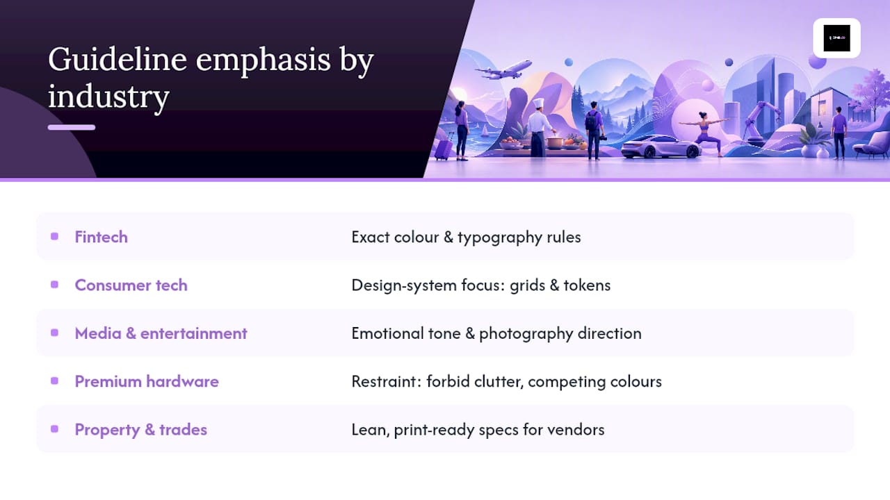
Premium hardware brands such as Bang & Olufsen guard restraint above all else: what the guide forbids (clutter, busy backgrounds, competing colours) matters more than what it permits. Property developers and trades businesses, a category Jarvisandco works with often, tend to need something leaner: a guide that survives being handed to a signage printer or a van-wrap contractor who has never heard the word "brand" used as a verb.
None of this means one industry's approach is wrong for another. It means the weighting shifts. A start-up copying Bang & Olufsen's minimalism without B&O's product quality behind it risks looking empty rather than restrained. Borrow structure, not tone, when you cross industries.
Why brand guidelines are never really finished
A brand guide written once and left untouched for five years is usually a sign the brand stopped growing, not that it got everything right the first time. Logos get simplified for app icons, colour palettes gain a secondary tint for dark mode, and typefaces get swapped when a licence expires or a webfont loads too slowly.
The most durable guides, Dropbox's and Netflix's among them, are built as living documents from the outset rather than static PDFs, which is exactly why hubs with version history have become the dominant delivery pattern noted across Frontify's example set. A start-up's first guide might be four pages covering logo, one colour, and one typeface. Eighteen months later, after hiring a marketing team and launching a second product line, that same brand often needs a voice and tone section, a partner co-branding policy, and rules for social media avatars that didn't exist in version one.
Treat evolution as scheduled, not reactive. Revisit the guide when the business hits a real milestone, a rebrand, a new product line, a major partnership, rather than waiting for confusion to force the issue. Keep a changelog, even a simple one, noting what changed and why. That single habit prevents the most common failure mode: three people using three different logo files because nobody documented which one is current.
Common mistakes that make guidelines unusable
Most brand guides fail for the same handful of reasons, and none of them are about taste.
The biggest is writing rules without showing misuse. A sentence saying "don't distort the logo" teaches nothing compared with a visual example of a stretched, squashed, and recoloured version sitting right next to the correct one, which is why Forge's template and most strong examples lead with visual dos and don'ts rather than prose.
The second is building a beautiful PDF nobody can find. A 40-page brand book buried in a shared drive folder helps nobody if the freelancer who needs it three months later has no idea it exists. The third is over-specifying at the expense of clarity: forty shades of "approved blue" is worse than three, because nobody will remember which one applies where.
The fourth mistake is skipping partner and co-branding rules entirely, then discovering during a sponsorship deal that nobody agreed how two logos should sit together. The fifth is treating the guide as finished the day it's delivered, with no named owner and no process for adding new assets as the brand grows. Concrete examples and easy asset access consistently separate guides people actually use from ones people quietly ignore.
How Jarvisandco applies these lessons for clients
After 15-plus years building brand guidelines for UK businesses, one pattern holds: clients use the examples they can act on, not the ones that look impressive in a pitch deck. Our deliverables typically pair a practical messaging framework with a usable asset pack, delivered over a few weeks for most SMEs. Building in-house works if someone owns it; commissioning an agency makes sense when nobody currently does.
— Luke
Get a brand guide your team will actually use
Jarvisandco is the alternative to piecing together your own brand book from scattered templates and half-finished style sheets: you get a proper logo system, colour and type rules, and an asset pack built specifically for your business, without the guesswork of adapting someone else's example. Costs and timelines vary by scope, but our branding price guide gives most small business owners a realistic starting point before they enquire.
We also handle the practical side that guidelines alone don't solve, from a refreshed website that matches your new visual identity to printed materials that need the same rules applied consistently. If consistent brand application is already on your radar as a conversion driver, PRYDE Designs makes a solid case for why it's worth getting right the first time. Get in touch through Jarvis & Co to talk through scope and a realistic timeline for your business.
Sources
- 19 Brand Guidelines Examples To Inspire Your Own
- Brand Guidelines Template for Agencies (Free) | Forge
- Guidelines
- The branding style guidelines documents archive • The design ...