
If you want quick inspiration that actually maps to usable patterns, inspect these responsive sites now and copy this one thing first: audit your primary mobile call to action and fix whatever makes it hard to tap or find. That single change fixes more lost leads than most full redesigns.
Study these first: Dribbble for its fluid image grid that never breaks rhythm on any screen, Swiss (SWISS Air) for booking flows that survive the jump to a five-inch screen, Dropbox for navigation that collapses without losing hierarchy, Etsy for product imagery that scales cleanly across breakpoints, Wired for editorial layouts that reflow content without burying the story, Forefathers Group for restrained typography that stays legible at any width, and Magic Leap for proving that bold visual storytelling can still be fast on mobile.
Pro Tip: Before you touch layout code, resize your browser window slowly from 1400px down to 320px and watch where things break. That's your real punch list, not a generic checklist copied from a blog.
Key Takeaways
Responsive websites work when content hierarchy, touch-friendly navigation, and image performance are designed for the smallest screen first, then enhanced upward.
| Point | Details |
|---|---|
| Fix the mobile CTA first | Audit your primary call to action on mobile before any wider redesign work. |
| Study patterns, not screenshots | Copy the specific behaviour behind Dropbox's navigation or Etsy's image scaling, not just the look. |
| Design breakpoints around content | Break layouts where they feel cramped, not at fixed device widths. |
| Test under real conditions | Resize, throttle to 3G, and check tap targets before calling a site responsive. |
| Choose responsive for most SME sites | Adaptive design suits complex platforms, but one flexible codebase suits lower maintenance budgets. |
Table of Contents
- Responsive website examples that teach a specific lesson
- Media queries, fluid grids and flexible images explained simply
- Mobile-first or desktop-led: which workflow fits your project?
- How to tell if a site is genuinely responsive
- What years of building responsive sites has taught Jarvis & Co
- Real challenges responsive redesigns run into (and how they get solved)
- Responsive design vs adaptive design: which one should you choose?
- Where responsive design is heading in 2026
- Get a responsive website built around your customers, not just your desktop
- Where to look next for inspiration and testing
- What most responsive design advice gets backwards
- Sources
Responsive website examples that teach a specific lesson
Galleries are everywhere, but most just show you pretty screenshots without telling you why something works. The ten examples below each demonstrate one behaviour worth copying, and are grouped by the problem they solve: navigation, imagery, forms, and content hierarchy. Collections such as Awwwards' responsive design category are genuinely useful for creative inspiration, but pair them with a technical checklist, because a beautiful screenshot tells you nothing about how a layout behaves under a slow connection.
Navigation patterns
- Dropbox. The top navigation folds into a slim hamburger menu below 768px, but critically it keeps the account and upgrade links visible rather than burying them two taps deep. If you're building a SaaS or subscription site, replicate this by auditing which two or three links actually drive revenue before you collapse anything.
- Swiss (SWISS Air). The booking widget doesn't shrink, it restructures. Date pickers and passenger selectors stack vertically and swap dropdowns for full-screen pickers on mobile. Copy this for any multi-step form: don't just squeeze the desktop version, redesign the interaction for a thumb.
- Forefathers Group. A single, sticky call-to-action bar persists through scroll on mobile, while the desktop version uses a conventional header. The implementation note here is simple: use
position: stickywith a z-index high enough to sit above content but low enough to avoid overlapping modals.
Imagery and media
- Etsy. Product grids use
srcsetandsizesattributes so a phone downloads a smaller file than a desktop monitor, keeping load times sensible even with hundreds of listings on one page. Apply this anywhere images dominate the page weight, particularly e-commerce catalogues. - Dribbble. The portfolio grid is a genuinely fluid layout, columns drop from six to two without a single hard breakpoint feeling forced. The lesson: base your breakpoints on where content starts looking cramped, not on standard device widths.
- Magic Leap. Full-bleed video backgrounds swap to lighter static imagery on smaller viewports to protect load speed, a pattern worth stealing if your homepage leans on video hero sections.
Editorial and content hierarchy
- Wired. Long-form articles reflow from a three-column desktop layout to a single column, but pull quotes and inline images get resized rather than dropped, preserving the storytelling rhythm. If you publish long content, test that nothing structurally important disappears at narrow widths.
- Etsy (again, for a different reason). Category filters move from a persistent sidebar to a collapsible drawer, which keeps the product grid as the visual priority on mobile.
Forms and conversion
- Dropbox. Sign-up forms reduce from multi-field desktop layouts to single-column mobile forms with larger tap targets, cutting the visible field count where possible. Fewer visible fields on mobile consistently reduces abandonment.
- Swiss (SWISS Air). Payment forms use native mobile input types (numeric keyboards for card numbers, for instance), a small detail that removes friction at the exact point customers are handing over money.
Media queries, fluid grids and flexible images explained simply
Three technical foundations make every example above possible, and none of them are optional extras.
Media queries (defined under W3C CSS3) let your CSS apply different rules depending on viewport width, so a three-column layout becomes one column below a set threshold. Fluid grids use relative units (percentages, fr, vw) instead of fixed pixels, so columns resize proportionally rather than snapping between fixed states. Flexible images scale with max-width: [100%](https://developer.mozilla.org/en-US/docs/MDN/Writing_guidelines/Howto/Images_media) and height: auto, so a hero photo never spills outside its container.
Performance sits right alongside these fundamentals, not after them:
- Serve modern formats like WebP or AVIF instead of legacy JPEGs where browser support allows.
- Use
srcsetso phones don't download desktop-sized files. - Lazy-load below-the-fold images and video.
- Trim critical CSS so the first paint isn't blocked by unused styles.
Mobile devices now account for roughly 62% of all web traffic, and 96% of internet users access the web on mobile at least some of the time. That skews every performance and accessibility decision toward the smallest screen first, including touch targets sized for a thumb (44px minimum is the safe baseline) and visible focus states for keyboard and switch-device users.
Mobile-first or desktop-led: which workflow fits your project?
Mobile-first design starts with the smallest screen and prioritises essential functionality before layering in enhancements for larger displays, according to UXPin's mobile-first guide. Responsive design, more broadly, is the umbrella technique of one codebase adapting across all screen sizes, whether you start small or large.
Favour mobile-first when your traffic is majority mobile, when page speed is a ranking or conversion factor, or when the KPI is lead capture rather than data-dense browsing. Desktop-led work still suits internal tools, dashboards, or B2B platforms where the primary user genuinely sits at a desk.
A three-step mobile-first checklist:
- Strip to essentials. List only the content and actions a mobile user needs to complete the task, cut everything else.
- Build up, don't scale down. Design the 320px layout first, then progressively enhance for tablet and desktop, per Nielsen Norman Group's progressive enhancement principle.
- Test the smallest screen last, not first. Once desktop enhancements are added, retest mobile to confirm nothing regressed.
How to tell if a site is genuinely responsive
Screenshots lie. The only reliable way to judge responsiveness is to interact with a site under realistic conditions.
- Resize your browser window slowly from full width down to 320px and watch for overlapping text, cut-off buttons, or horizontal scrollbars.
- Use your browser's device emulator (Chrome DevTools or similar) to check specific breakpoints, not just "mobile" in general.
- Throttle the network to slow 3G and reload; a site that only looks responsive on fast Wi-Fi isn't finished.
- Check that the core task flow (checkout, booking, sign-up) survives intact at every width, with no critical content hidden behind an extra tap.
Pro Tip: Turn this into a five-line QA checklist you paste into every brief: resize test, throttled load test, tap-target check, focus-state check, task-flow completion test. Five minutes catches most launch-day embarrassments.
What years of building responsive sites has taught Jarvis & Co
After more than 15 years building websites for UK small businesses, trades, and clinics, a pattern repeats: clients who prune content before a responsive redesign consistently see better mobile engagement than clients who simply ask us to "make it fit." One property developer client saw enquiry form completions rise noticeably after we cut a six-field mobile form down to three. A clinic client's bounce rate dropped once we moved their booking CTA above the fold on mobile.
Content that fails on a mobile screen usually didn't belong on the desktop version either. Auditing for mobile is really an audit for clarity.
Three habits we return to on every project: prioritise the one CTA that matters most per page, lazy-load anything below the fold, and prune content ruthlessly before touching layout code.
Real challenges responsive redesigns run into (and how they get solved)
The theory of responsive design is tidy. The practice rarely is. A recurring challenge is data-heavy interfaces, tables, dashboards, comparison charts, that were never designed to shrink. Forcing a twelve-column pricing table into a phone screen usually means the table needs to become something else entirely: a stacked card layout, an accordion, or a horizontally scrollable strip with clear affordance that more content exists off-screen.

Another common snag is legacy content. Sites built years before mobile traffic dominated often carry embedded iframes, fixed-width images, or third-party widgets (booking systems, chat plugins) that simply don't resize. The fix is rarely elegant, usually it means replacing the widget, wrapping it in a responsive container with overflow handling, or negotiating with the vendor for a mobile-compatible version.
Forms present a subtler challenge: desktop forms often ask for more information than a mobile user will tolerate typing on a glass keyboard. The solution that consistently works is splitting a long form into shorter steps, saving progress between them, and using native input types so a phone number field triggers a numeric keypad rather than a full keyboard.
The common thread across all three problems is the same: responsive challenges are rarely about CSS syntax. They're about deciding what to cut, restructure, or defer for a smaller screen, which is a content and product decision dressed up as a technical one.
Responsive design vs adaptive design: which one should you choose?
Responsive design uses one flexible layout that adapts continuously across screen sizes with fluid grids and media queries. Adaptive design instead serves distinct, fixed layouts at set breakpoints, essentially separate versions of a page for phone, tablet, and desktop.
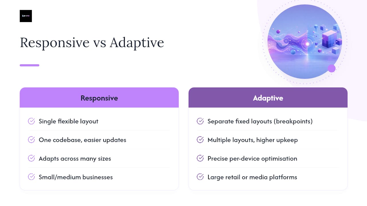
Responsive design's biggest advantage is maintenance: one codebase, one set of content to update, and it degrades reasonably even on screen sizes nobody anticipated. Its downside is that a genuinely fluid layout can be harder to fine-tune for one specific device, since you're designing for a range rather than a fixed target.
Adaptive design's advantage is precision. Because each breakpoint has its own dedicated layout, designers can optimise the experience exactly for that device class, useful for content-heavy sites where a phone layout needs a fundamentally different information architecture than desktop. The cost is maintenance overhead: multiple layouts mean multiple things to test, update, and keep consistent whenever content changes.
For most small and medium business sites, responsive wins on practicality alone, lower long-term cost, easier updates, and it copes gracefully with the growing range of screen sizes and foldable devices entering the market. Adaptive design still earns its place on complex platforms (major retail or media sites) where the investment in separate layouts pays off through tightly optimised conversion paths. If you're commissioning a new site rather than maintaining an existing enterprise platform, responsive is almost always the pragmatic choice.
Where responsive design is heading in 2026
Content-driven breakpoints are replacing device-specific widths as the default approach. Rather than designing for "iPhone" or "iPad" dimensions, teams are setting breakpoints wherever a layout starts to feel cramped, a shift that protects designs against the constant churn of new device sizes and foldable screens.

Variable fonts and fluid typography (using clamp() in CSS) are letting text scale smoothly between minimum and maximum sizes instead of jumping between fixed values at each breakpoint. Container queries, now supported in modern browsers, let individual components respond to the size of their parent container rather than the whole viewport, which matters enormously for modular design systems built from reusable cards and widgets.
Expect more sites blending responsive layout with adaptive UI components, off-canvas navigation that appears only below a certain width, or simplified mobile-specific CTAs, rather than treating "responsive" and "adaptive" as mutually exclusive philosophies. Performance budgets are also tightening: with well over half of traffic arriving on mobile, sites that ignore Core Web Vitals on smaller screens will keep losing ground in search visibility and conversion rate alike.
Get a responsive website built around your customers, not just your desktop
Studying examples is a useful start, but most businesses don't have the time to translate ten inspirational patterns into working code, tested across breakpoints, without breaking something else along the way. That's the gap Jarvisandco exists to close.
We build custom website design for UK small and medium businesses, start-ups, trades, and clinics, with mobile behaviour treated as a first-class requirement rather than an afterthought bolted on before launch. If you're weighing up a full rebuild against smaller fixes, our guide to website redesign costs breaks down what typically drives the budget. And if you'd rather see how we approach a project from brief to launch, visit Jarvisandco to see our work.
Where to look next for inspiration and testing
- Awwwards' responsive design gallery for curated visual inspiration.
- One Page Love's responsive tag for single-page pattern examples.
- Figma's mobile-first resource library for design files and breakpoints.
- MDN's mobile-first glossary entry for the technical definition.
- Webflow's mobile-first best practices for testing tools and workflow tips.
- Brainiac Media's landing page work for conversion-focused responsive examples.
What most responsive design advice gets backwards
Most articles on this topic treat examples as decoration, a scroll of pretty screenshots with captions that say nothing about why the layout survives a narrower screen. The research behind this piece points somewhere else: the sites worth studying are the ones where you can name the specific CSS or UX decision behind the behaviour, not just admire the outcome.
The conventional advice, "look at award-winning sites for inspiration", undersells the actual skill, which is translating one observed pattern into your own content and constraints. Dribbble's fluid grid means nothing to a booking platform. Swiss's mobile payment flow means everything to one.
If there's a single priority worth acting on before anything else, it's content pruning. Every example in this piece that genuinely works on mobile got there by cutting something, a field, a menu item, an image, not by squeezing more into less space. Businesses that treat responsive design as a compression problem end up with cramped mobile sites. Businesses that treat it as an editing problem end up with fast, usable ones.
— Luke
Sources
- 7 Best Responsive Website Examples in 2026
- Best responsive design websites | Web design inspiration
- A hands-on guide to mobile-first design
- Responsive web design definition (NN/g)